This article will help you with a clear vision of web design best practices. These include, but are not limited to, color strategy, value propositions appearance, the location of the sign-up button, bars, and popup animations, quality of the pictures used in your website, the position of the search option, locations of social media page icons, and much more.
Why do You need To Follow Web Design Best Practices?
A common fact usually working behind every super prosperous business is a well-designed, SEO-friendly, eye-catchy website. Your website speaks on behalf of you when a potential customer browses it. An outstanding browsing experience may be one of the biggest reasons for turning visitors into customers. So, it’s always essential for you to know what makes a website user-friendly and attractive. This is how you’ll be able to raise your business’s credibility.
Apart from these, a professional website design also follows some universal standards like brand, coding, and accessibility standard. Continue reading till the end to get a transparent idea about how you can get your business website designed so that it can award you with the highest conversions. Below is a list of the ten best web design practices you should implement in your website today for higher transformation and business success.
Location of the Company Logo
This is a big determiner of making your website more visible and allows you to attract organic traffic to your business website. The logo should be at the top left corner of all website web pages. It needs to be clickable. This is a universal standard that every web designer follows while designing a website. The reason behind this is that the company logo represents your brand, and keeping it on every page of your website helps you keep up the consistency of your brand. A web designer may help you with predetermined colors, logos, and vocabulary that you can use on your website. Always go for the same, as these will apply to your website’s symbolic representation, composition, pictures, and videos.
Smooth Navigation
When a visitor stops by your website and starts browsing, he always expects to fetch the complete information by investing minimum time. The easy navigation across the top of the website makes the user experience convenient, and the visitor will find your site attractive. The universal standard of web designing says that a good website should allow the main navigation, located at the top of every web page in the header area. This allows a top-graded horizontal navigation that meets the website standard.
Constructing a Smart and effective CTA
When you design a website for your business, your primary target includes dragging massive web traffic toward your business page to advertise your products or services. To achieve this goal, you must build a compelling call-to-action strategy. This will help you to get genuine buyers. CTA is the way that tells your customers what you want them to do next.
Good website designers always take care of the CTA part specifically to serve the purpose of designing a website. They prioritize the CTA alignment at the initial level. “ Contact Us,” “ Learn More,” and “Subscribe to Our Newsletter” – these all come under the CTA. These should be designed in a proper way, such as “Learn More” should always be located at a higher position on the webpage, and “contact us” should come just below the “learn more” tab. “Subscribe to Our Newsletter “should arrive at the bottom-most part. This is considered one of the best web design practices.
Arranging Carousel
The carousel is nothing but the slide show of the home page. This includes a pivoting series of messages along with images. As per a recent study, almost 33% of the most successful websites follow this as one of the best web design practices. So, take care of this part and choose the best-fit images and messages for your visitors, depending on your business type. Remember, the first message in front of your visitor is his overall impression of your brand. So, do not forget to work a little harder on this part.
Page Loading Speed
It would be best if you were extra careful on this particular part. Your sale may drop significantly if your web page loads faster than usual. A fraction of a second is vital. Most of us desperately expect the webpage we are visiting to load in less than two seconds, and many visitors leave the site if it takes more than three seconds to load. So, check the best practices to reduce the web page loading time.
Use a Content Delivery Network that works with a website’s static files, such as Javascript, CSS, and images. Then it throws them in the server’s bucket close to the user’s location. This way, it works efficiently with the capability of loading a page swiftly.
Use the latest image format to reduce the size of the images on your website. It helps save bandwidth and decrease the weight of the pictures. Naturally, it helps to reduce page loading time.
Keep an eye on your website plugins. These are used to add new and latest functionalities to your site. However, the more plugins your website has, the more time it takes to load. So, manage your plugins so they can effectively add functionalities and load the page in minimum time.
You can also save the numbers of the byte that any webpage sends over the network by compressing your resources. All you need to do is excellent content optimization and create a proper consistency of the coding of HTML and CSS. This will help you with the required compression a web page needs to load faster. You can easily take professional help to perform this action.
Concentrate on SEO
SEO is the hero of good web design practices. This is the determiner of the volume of organic traffic toward your website. SEO promotion is no longer a preference for any business; it has become vital. It works on the method to increase the search ranking of a web page so that the online visibility of the same also increases.
As per the trend, almost 93% of online involvements begin with the search tool, and around 50% prefer to check anyone among the first two or three classifies. From these statistics, it’s straightforward to understand that you need an SEO service to generate substantial traffic toward your business website.
SEO companies perform several checks, like the content quality of your web page, content length, social media links on your website, web page loading speed, schema markups, mobile responsiveness, visitor intent, presence of related backlinks on your web page, and much more. They also consider that indexed pages can appear on a search list and act accordingly. So, opting out of the right SEO solution from a professional will always help you increase the website’s visibility. That is why it has been considered one of the best web design practices.
Email Advertising
Email marketing is one of the most traditional practices of marketing and advertising that has been playing an active role in the successful marketing venture for over a decade. It keeps you and your customers in touch. You should equip your website with synchronization of the email marketing system. Locating the email address in the header or the footer will increase the effectiveness of your marketing effort. Remember this while you design your website, as this comes under a good web design practice per recent trends.
Check for Social Media Icons
Nowadays, social media is one of the most powerful online marketing platforms. They are pretty valuable for advertising brands and driving content. Every website today contains the option of linking your social media account to a particular website. Placing the icon linking social media in the site’s footer will help you with the number of visitors who prefer to connect their social media accounts to websites.
Placing them in the footer has a particular significance. Generally, clicking on those icons takes away the visitor in an external link. So, if you put them in the header and the user clicks on it before reading the main contents of the website, he may not return to the site again. However, placing them at the footer will help them go through the main content, and then they can promote you via social media by clicking on the icons. This will increase the particular user’s interest in your product or service. So, it is now almost standardized to set those icons at the footer of any web page, and it is considered one of the web design best practices.
Check if your Website is a ‘responsive’ one.
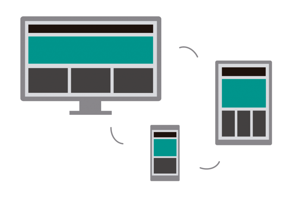
‘Responsive’ websites refer to such websites that are accessible from any device such as a mobile, laptop, computer, or tablet. These websites follow the “mobile-first index” as per the announcement of Google in 2018. These websites support different layouts to be readily displayed on a desktop or laptop and a mobile screen. With the responsive design system, they can change their forms.
These websites use fluid grids. The page ingredients are accordingly sized by proportion instead of pixels. These are specially enabled to resize images and videos according to the screen size.
These websites are, of course, more appreciated by the users as they don’t have a limited audience target. Designing a functional, responsive website will help your business with more conversions. So, before you go ahead and create your website, please tell your designer to add this particular attribute. This is one of the best and most modern web design practices.
The color scheme must match your brand.
Apart from the above, one more thing that comes under the best web design practice is the color scheme of your website. As discussed earlier, your website is your brand’s image in front of the users due to this. It is always required to care enough for your website’s appearance, including the proper color contrast. The website’s background and text colors should tally with each other. There must not be any difficulty for the users when they stats to read the website content because of uneven background and text colors.
If your site looks great, the visitor will be able to remember the contents. Our eyes are an indicator that sends a message to the brain if anything seems too attractive to them. You need to follow this simple theory to get the highest user response.
Are you equipped with all of the above Web Design Best Practices?
If your website lacks any of the above web design practices, it’s time for you to reach out to Wowbix web designers. Our professionals can design your website so that it can drag and hold the maximum traffic and turn your visitors into your potential customers. We’ll create your new website following the standard of best web designing practices. This will help you to get a boost in your turnover from your business.
Also, if you still have questions about web design practices, comment below or contact us for a free consultation.


